Hello sewists, welcome back to another WonderFil blog! As we come into the new year with new projects on our to-do list, we thought we might chat with you about colour theory. Colour theory is a large part of any design process when you’re planning your projects and can elevate your projects a lot when done properly. So, whether you’re creating a fun new quilt, crafting your own garment, or making something small this blog has something for you!
Why is colour theory important
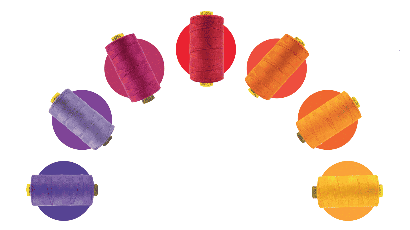
Colour theory can change the way that people look and react to your projects. A well put together colour palette can be very pleasing to the eye and incite a positive reaction to those looking at your projects. If you’re making a quilt and want to add some decorative topstitching to it with heavy thread consider the colour of the fabrics, and the colour of the other threads you’re working with to create a beautifully curated selection of threads and fabrics. Having a good understanding of colour theory can also inspire new project ideas just based on a colour palette you love!
Let’s talk about the colour wheel
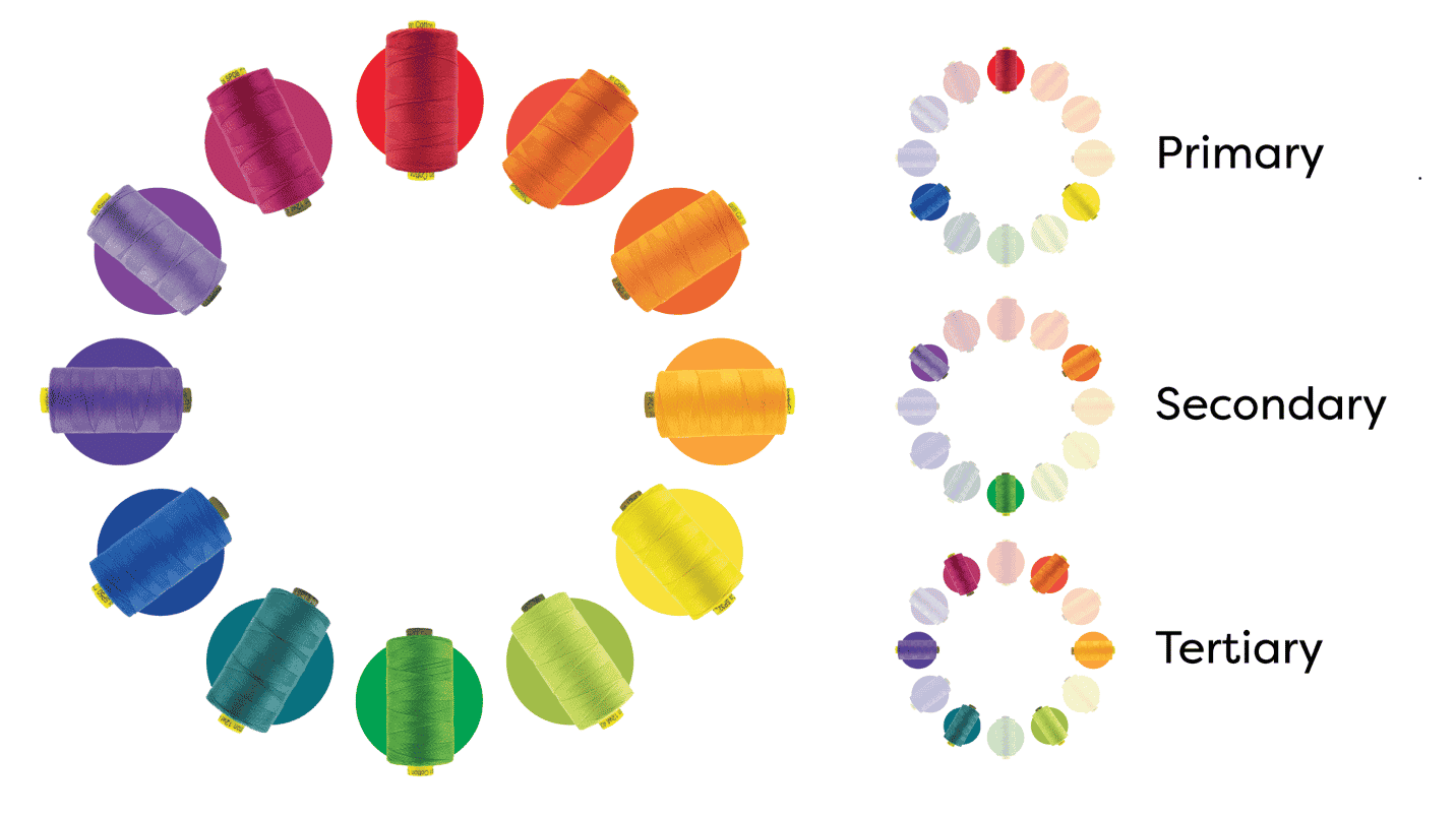
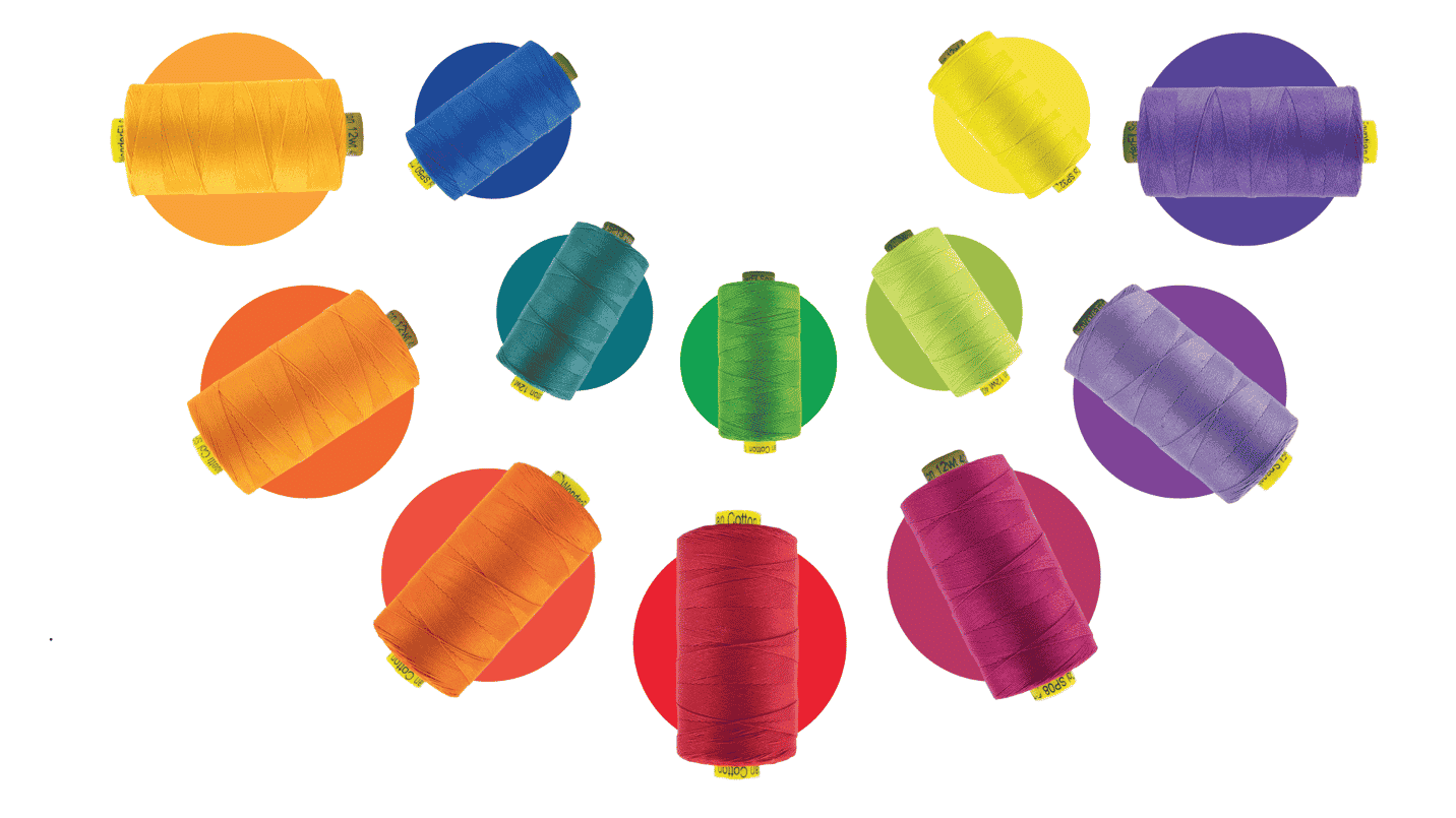
Having an image of the basic colour wheel is the easiest way to create your own colour palette. We all learned at a young age the primary colours, Red, Yellow and Blue. What if you don’t want to use these three basic colours though? Luckily these colours break down into secondary and tertiary colours. The secondary colours are Orange, Green, and Violet. The secondary colours breakdown once again, only this time into six tertiary colours: Red-Orange, Yellow-Orange, Yellow-Green, Blue-Green, Blue-Violet, Red-Violet. This colour wheel shows all of the possibilities for colour combinations!
What kinds of colour combinations are there?
There are three main colour combinations that you can always rely on when choosing your colour palettes, no matter how you place them on the colour wheel.
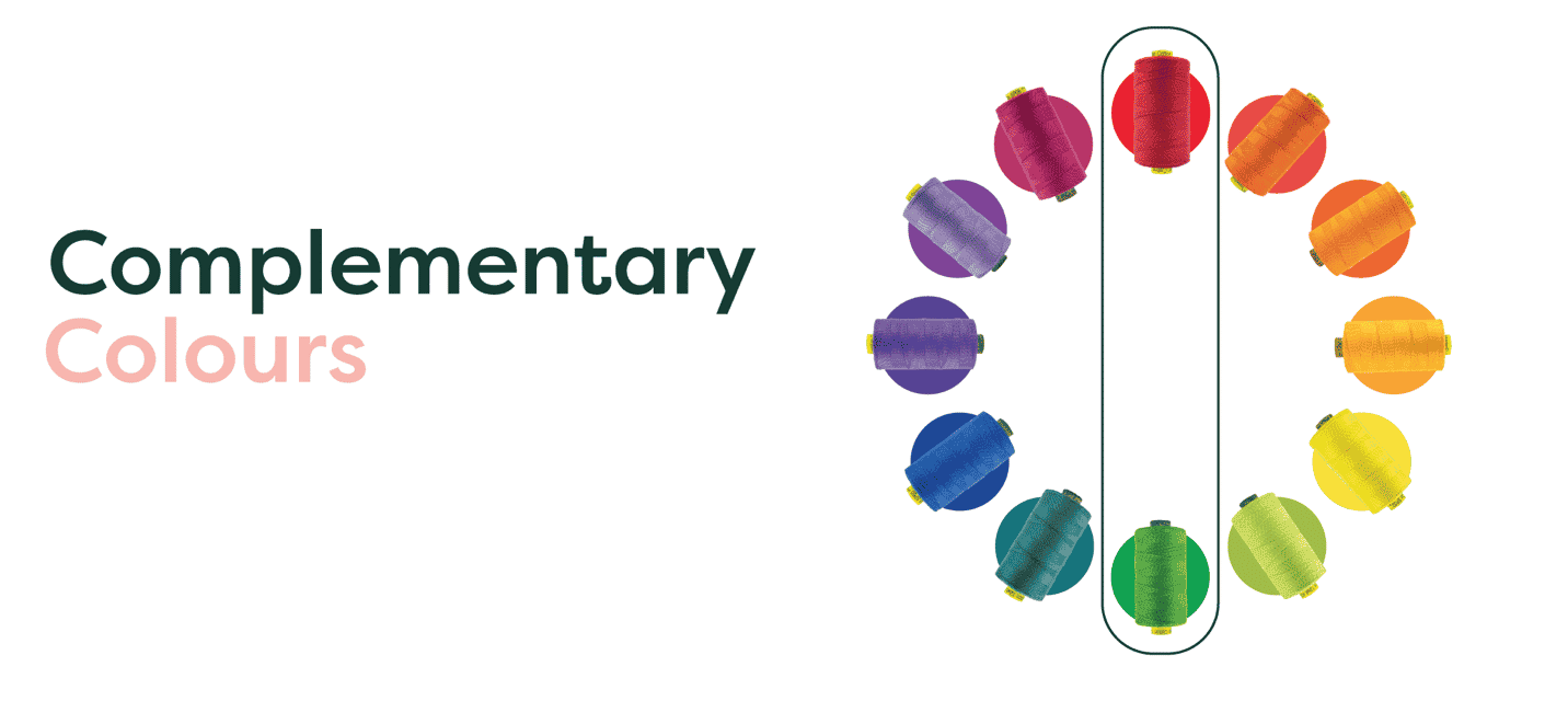
Complementary colours are two colours opposite of each other on the colour wheel. Because there’s typically a sharp contrast between the colours it can make your projects pop. The most commonly used examples of complementary colours is red and green!
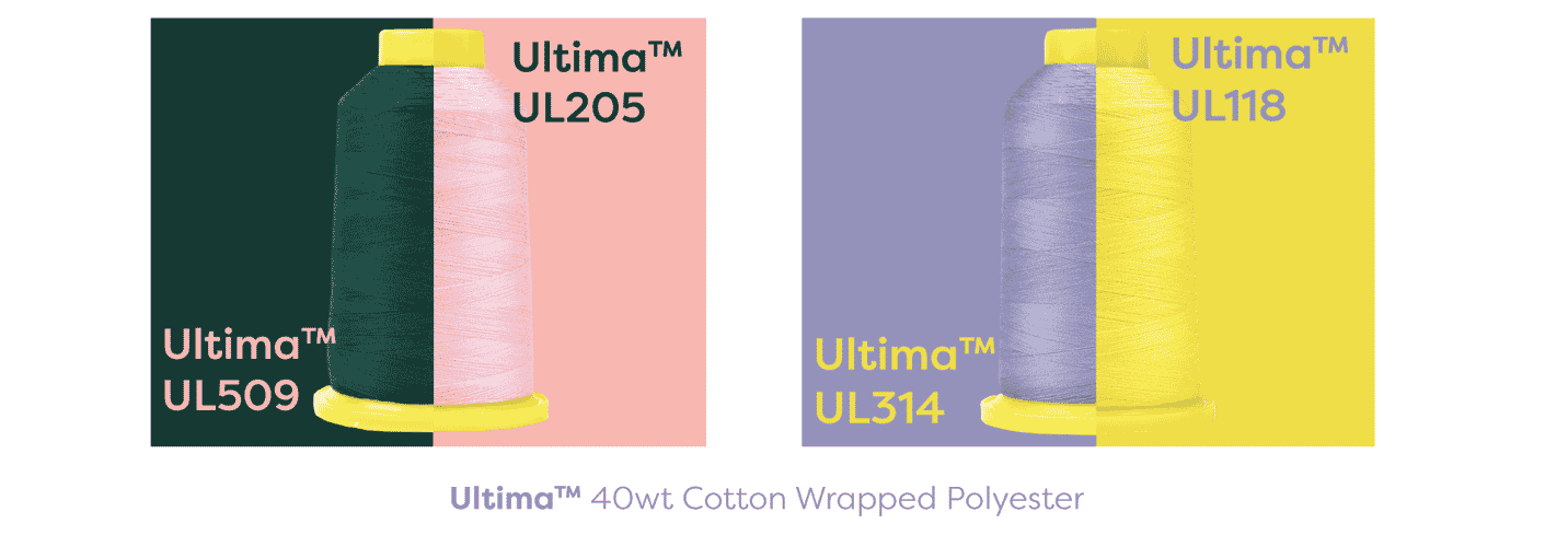
It’s easy to come up with amazing colour combinations, but what will it look like when thread and fabric interact with one another?
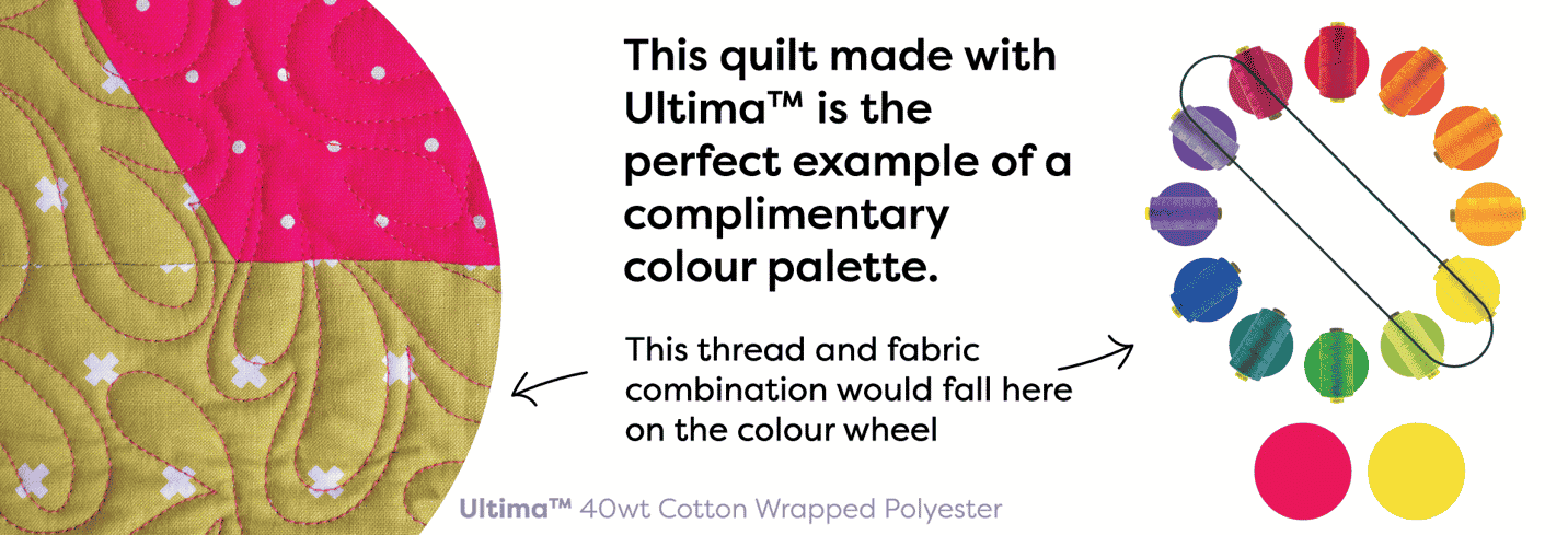
You can find these Ultima™ threads in a shop near you, or online at https://shopwonderfil.ca/product-category/ultima/
But, there’s a plethora of other really great complementary colour combinations that you can use such as light pink and emerald green, yellow and purple!
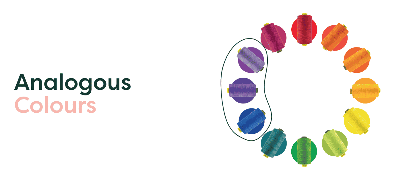
Analogous are three colours anywhere on the wheel directly beside each other. When choosing an analogous colour palette there will be one colour that will dominate the palette, and the other two will work to support it as accent colours. As a result an analogous colour palette can be very pleasing and in some cases even calming to the eyes. Analogous colours are perfect for when you want a monochromatic look without giving up on great colour combinations.
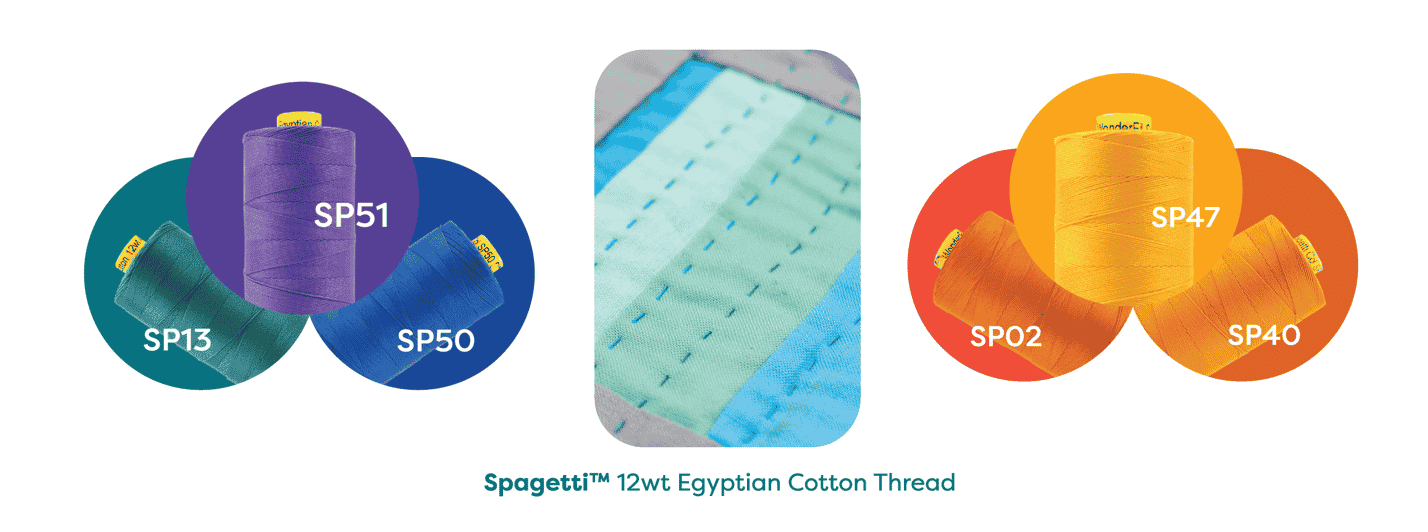
You can find these Spagetti™ threads in a shop near you, or online here https://shopwonderfil.ca/product-category/spagetti/
Some examples of the perfect analogous colour palette are light green and blue through a rich purple, or even just light blue through a rich royal blue and a deep purple for a regal look. And for a happy and light springy look you could combine pale blue, deep purple and lilac or even red orange, orange and yellow!
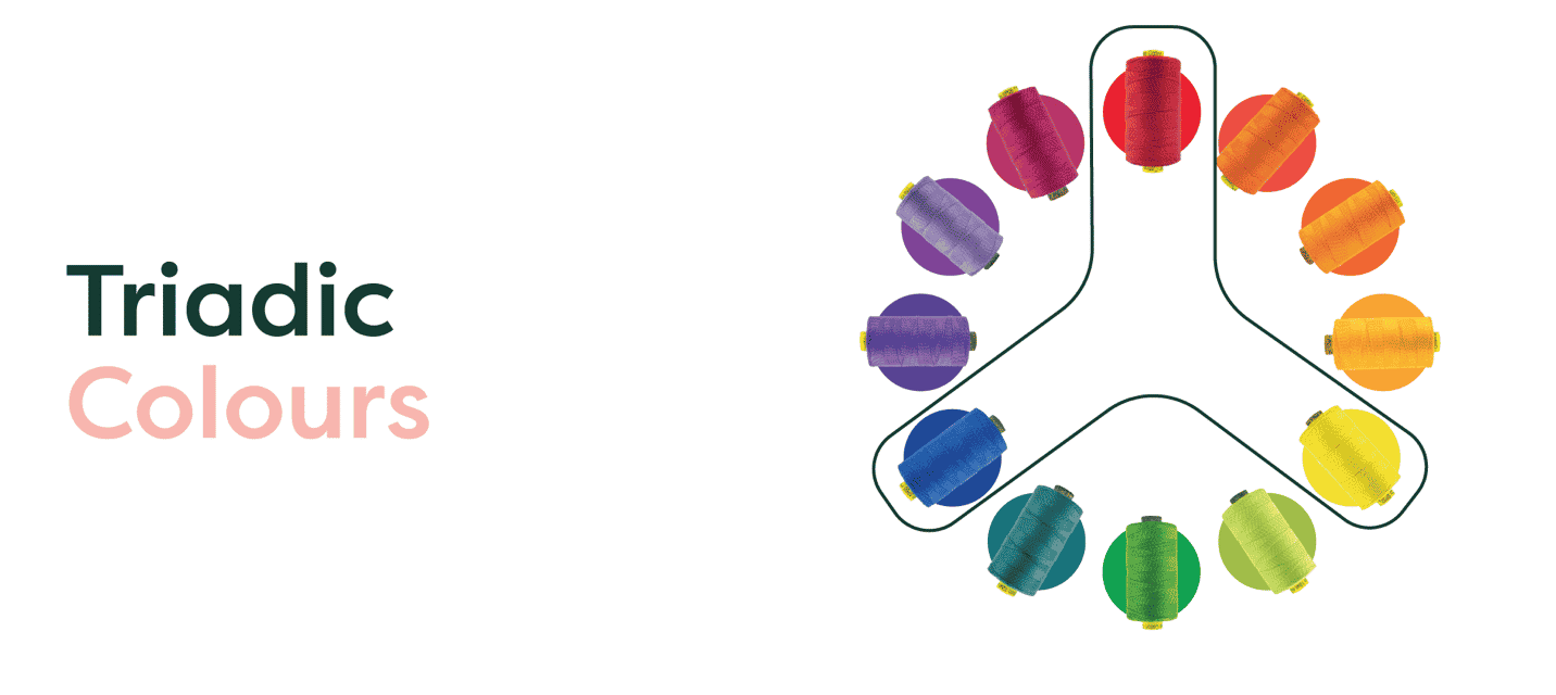
Triadic colours, or split complementary colours, are three colours evenly spaced around the colour wheel, and tend to be very bright and dynamic colours. Using a triadic colour palette can create contrast and harmony within your colour palette, and make your project really pop.
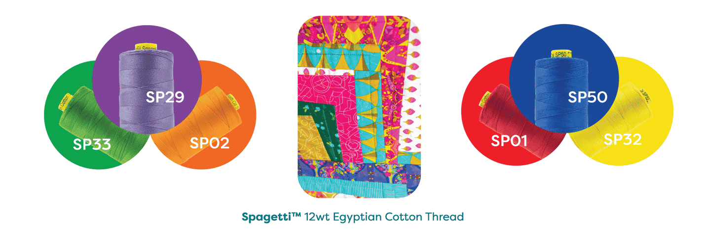
You can find these Spagetti™ threads in a shop near you, or online here https://shopwonderfil.ca/product-category/spagetti/
Some great examples of these colours in action are violet, green and orange or even yellow, blue and red!
Warm vs. Cool colours
Knowing the distinction between warm and cool colours can also really help you in your decision-making process when it comes to colour. And even though the distinction between warm and cool colours might seem easy, there are some colours that can fall into warm or cool categories that might shock you!
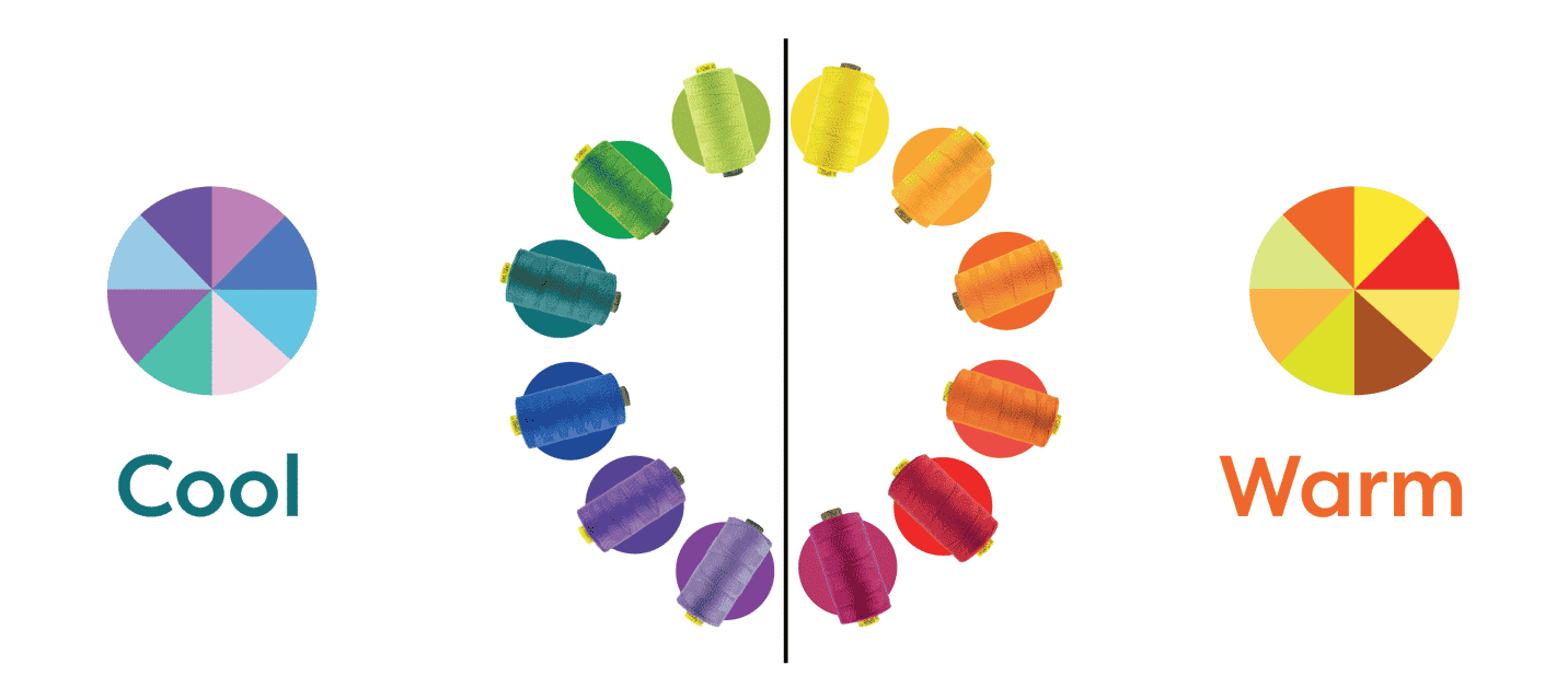
For example, some purples can fall under both warm and cool colours depending on their undertone. This also applies to greens! We’ve put together a couple of visual samples to show you exactly what we mean!
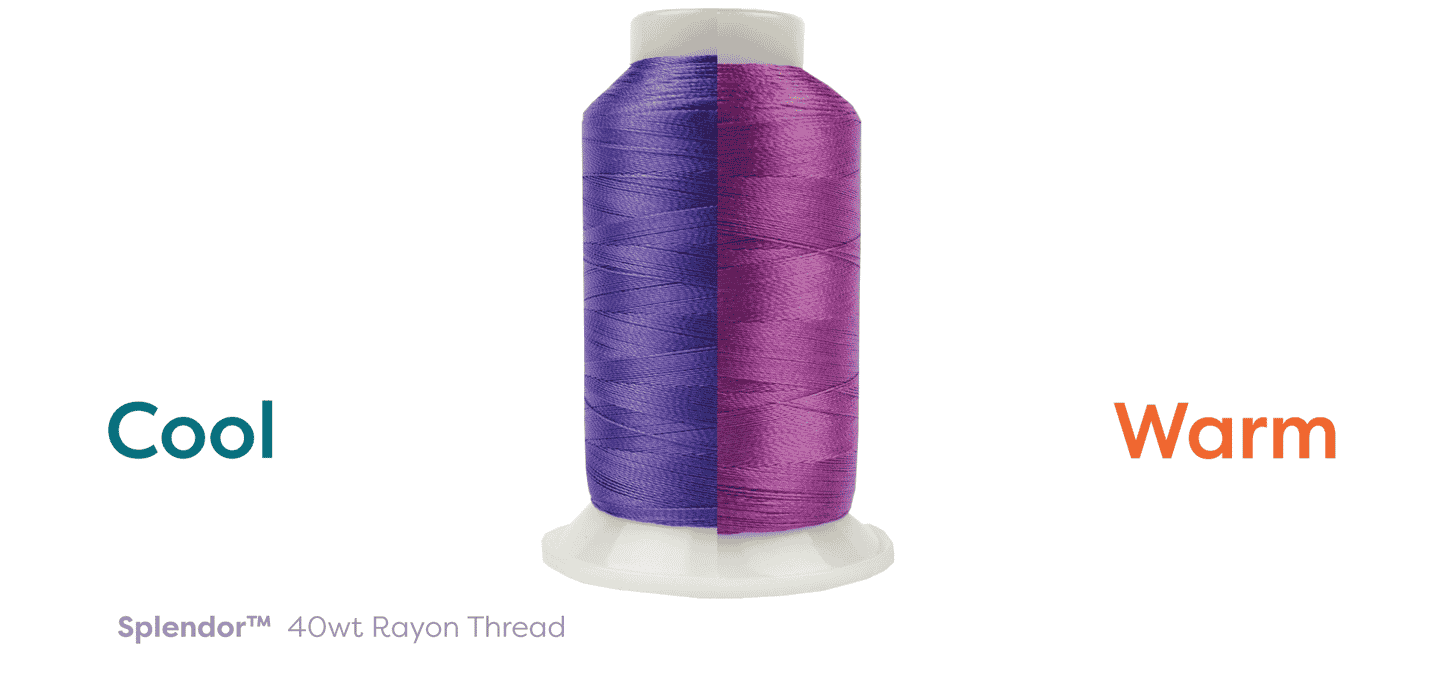
In this example we’ve pulled a cool and a warm toned purple thread. Splendor R5118 is a cool purple, and in contrast with the warm toned purple you can see that this thread has blue undertones. The warm purple thread, Splendor R1121, in comparison to the cool coloured thread has obvious red undertones, creating a pleasantly warm coloured thread!
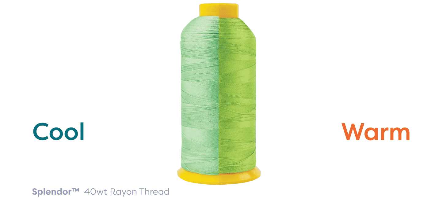
Greens can be a bit harder to differentiate between warm and cool because there’s no obvious red undertones in the warm greens, instead you have to look for a much less obvious yellow undertone. Splendor R4145 is a good example of a warm toned green, especially when contrasted against a cool toned green. Splendor R4128 is a great example of a cool toned green because of the soft blue undertone.
You can find these Splendor™ threads in a shop near you, or online here https://shopwonderfil.ca/product-category/splendor/
So how can you pair this knowledge with your sewing projects?
Now that you have all of the knowledge needed to confidently make colour decisions based in colour theory! Take into account the colours of the fabrics you’re working with, what the mood of the project is, if you want some nice contrasting colours or a more monochromatic palette. Spend some time and curate a colour palette using colour theory that feels exactly how you think the project should feel!
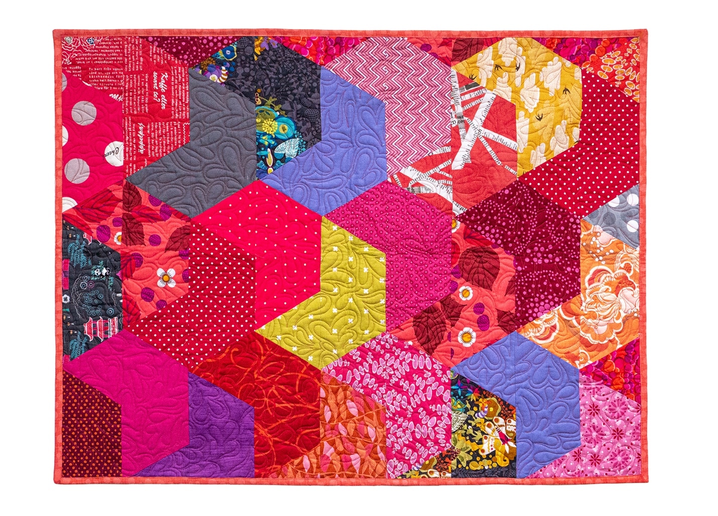
This quilt is a great example of using lots of warm colours with hints of cool tined purples and blues to create a visually exciting piece. Warm colours paired with a bright warm toned thread can create a very happy, energetic looking quilt! This project used our thread called Ultima™, a 40wt cotton wrapped polyester thread.
If you’re feeling inspired to create a project with rich warm tones, you can find some gorgeous fabrics from Alison Glass, some of which are featured in the quilt pictured above! You can shop her fabric bundles here: https://alisonglass.com/product-category/shop-materials/fabric-bundles/
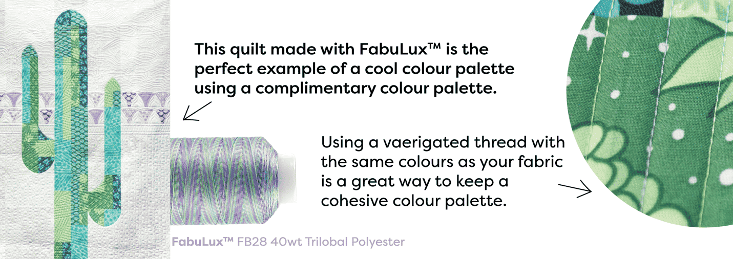
This quilt pattern by Sew Kind is the perfect example of making use of beautiful cool colours to create a calm, and balanced colour palette. This project used our thread called FabuLux™, a 40wt trilobal polyester, which creates a beautiful surface shine to the thread. The shine that FabuLux™ gives off is the perfect way to add a little bit of extra visual interest when you want a calmer and more toned down colour palette.
If you’d like some more reading on this topic specific to quilting, we’ve found this awesome blog post that goes into detail about quilting and colour theory! https://www.thesprucecrafts.com/how-to-use-a-color-wheel-2821255
And if garment making is your thing, here’s a blog post about fashion and colour theory! http://blog.bellacanvas.com/color-101-how-color-impacts-apparel-design/
And there you have it! You’re well versed in colour theory and are armed with all the information you need to make amazing colour choices in your next quilt, dress, home décor project and so much more. If you liked this blog, and would like to read more about topics like this you can comment below to ask questions or make other suggestions. If you’re going to put your new colour theory skills to work in your next project, be sure to tag us on social media using the hashtage #wonderfil so that we can share it! You can find the threads mentioned in this blog and more by visiting www.shopwonderfil.ca. You can also sign up for our free newsletter to receive more educational sewing tips, tutorials, and free patterns. Register by clicking here! We’ll see you again next time!

